
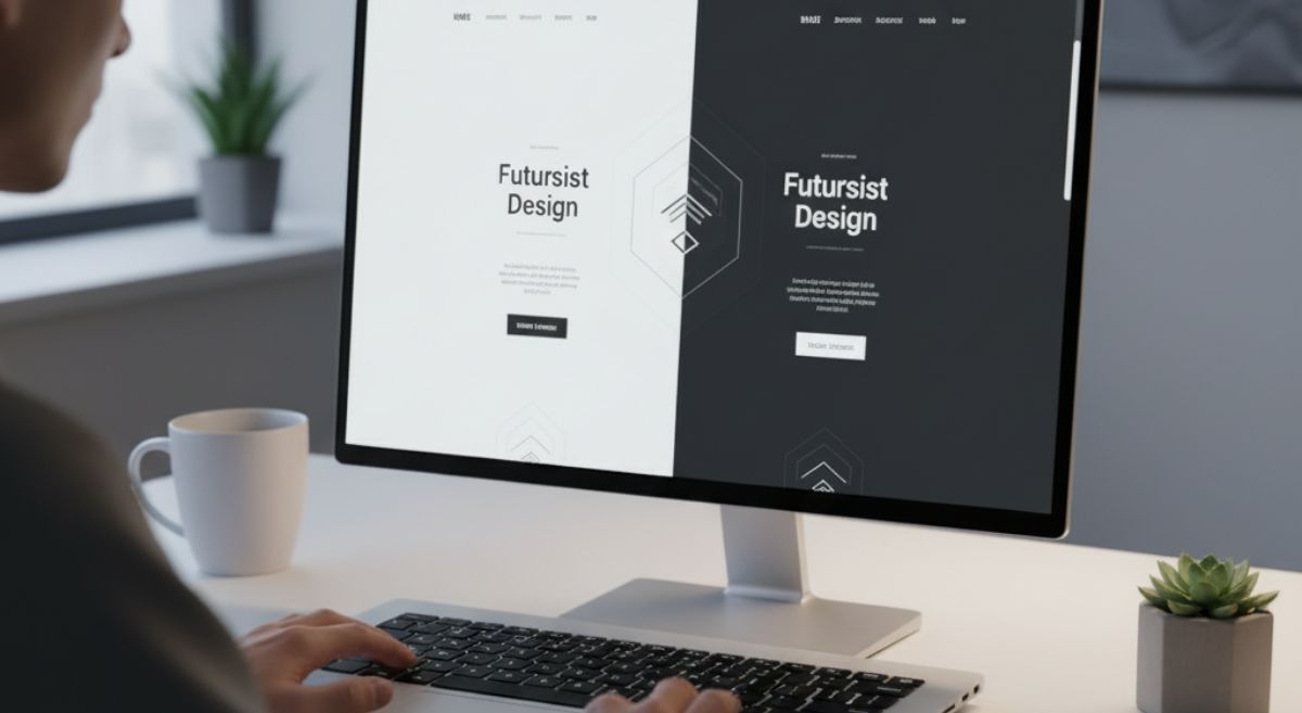
Dark Mode Web Design: Should Your Website Use It?
The first time I saw a website in dark mode, I remember thinking,
“Wait — why does this look instantly cooler?”
It wasn’t fancy animations or gradients doing the trick. It was just… darker.
Like someone dimmed the lights and suddenly the content felt cinematic.
That’s the magic of dark mode — it changes how your website feels before users even click a thing.
But here’s the real question:
Is that magic worth it for your own site, or are we just romanticizing a trend born from tired eyes and flashy apps?
Let’s unpack it — without buzzwords, without fluff. Just real talk about what dark mode actually means for your brand, your users, and your web experience.
The Psychology Behind the Darkness
You’ve probably noticed this pattern: everything tech-related has slowly gone dark.
Apple’s macOS, YouTube, Instagram, Twitter (or X — whatever we’re calling it now).
Dark mode became the new black. Literally.
But beneath the aesthetic lies something deeper — user comfort and emotional response.
Humans associate darkness with calm, depth, and focus.
When the interface fades into a dark background, the bright parts — text, photos, CTAs — suddenly get the spotlight. Your attention shifts naturally to the content that matters.
It’s like being in a movie theater. The world around you dims, and the story begins.
That’s the experience dark mode can create — if it’s done with intention.
But Here’s Where Designers Mess It Up
You can’t just slap a black background on a website and call it “dark mode.”
Design doesn’t work like that.
Colors behave differently in the dark.
Typography feels different. Even spacing matters more.
One of the biggest mistakes I see? Contrast crimes.
Light gray text on dark gray backgrounds that make you squint. Buttons disappearing into the shadows. Photos that lose detail because they were edited for a white canvas.
Dark mode isn’t a “theme.”
It’s an entirely separate visual environment.
And that means it deserves the same care you’d give your main brand design — maybe more.
Light Mode Has History. Dark Mode Has Emotion.
Traditional web design was born in white spaces.
Newspapers, books, magazines — all white. That’s what made the transition to the web feel familiar.
Dark mode flipped that.
It said, “Hey, we’re not trying to imitate paper anymore.”
It’s digital-first, emotional, and cinematic.
That’s why creatives, photographers, tech startups, and portfolio sites love it — it feels alive.
But here’s the catch: not every brand wants to “feel alive.” Some want to feel clean, open, reliable. For them, light mode still communicates clarity and trust better.
So before even thinking about design, ask yourself:
What emotion do I want my website to create?
Because dark mode amplifies emotion — both good and bad.
If your visuals are too busy or your contrast isn’t perfect, it’ll show.
When Darkness Becomes a Problem
Dark mode looks amazing at midnight on your phone.
But in broad daylight on a bright monitor? It’s another story.
Ever tried reading gray-on-gray text with sunlight hitting your screen? Brutal.
That’s why most text-heavy websites — think blogs, news outlets, learning platforms — still stick with light backgrounds. Readability always wins.
Then comes the brand color issue.
Those bright oranges, pastel blues, or cheerful greens that look perfect on white?
They might glow like toxic neon on a dark canvas.
So the truth is: some brands just don’t belong in the dark.
Not because it’s ugly, but because it doesn’t speak their visual language.
A True Story: When Dark Mode Went Wrong
A client once asked me to “make the site dark mode like Spotify.”
Cool idea — except their brand colors were sunshine yellow and coral pink.
The result? Think “highlighter explosion in a cave.”
We tried to adjust. Muted the tones. Increased contrast. But every tweak made the site lose its personality.
Eventually, we dropped the dark theme entirely — and the engagement rate actually went up.
Moral of the story: design isn’t about trends.
It’s about context.
When It Works, It Really Works
On the flip side, when dark mode aligns with your brand and content, it can completely transform the experience.
Take a design portfolio — dark backgrounds make visuals pop.
Or a movie streaming site — dark themes help create immersion.
Or a tech product — it instantly feels more “premium.”
There’s something undeniably powerful about minimal light and maximum focus.
It’s calm. Confident. And if your users tend to browse in low-light environments, it feels natural.
👉 “Before you dive into dark mode, make sure your website runs fast — because design only shines when performance does.”
The Science Bit: Eye Comfort and Battery Life
You’ve probably heard people say dark mode is “easier on the eyes.”
That’s true — sometimes.
In low-light situations, dark mode reduces glare and keeps your eyes from burning after hours of screen time.
But in bright environments, it’s actually harder to read.
Your pupils open wider in the dark, which reduces visual sharpness. That’s why text-heavy sites might feel blurry or fatiguing in dark mode during the day.
Then there’s the battery advantage. On OLED or AMOLED screens, black pixels actually turn off, saving a noticeable amount of power.
If most of your traffic comes from mobile users, that’s a subtle but real perk.
Designing a Dark Mode That Doesn’t Suck
So, let’s say you’re ready to go dark — but you want to do it right.
Here’s what separates the good from the great:
1. Never use pure black.
Use deep gray tones (#121212, #1A1A1A). They’re easier on the eyes and make other elements feel softer.
2. Color-test your brand palette.
Adjust saturation and brightness until your colors pop without glowing.
3. Increase line spacing and font weight.
Light text on dark backgrounds needs breathing room to stay legible.
4. Keep shadows subtle.
In dark mode, shadows can get lost or make things muddy. Use light glows or soft outlines instead.
5. Always offer a toggle.
Let users choose. It’s not about what you prefer — it’s about what they’re comfortable with.
Dark mode shouldn’t be forced. It should be offered like a polite option.
The UX Angle: Choice = Respect
This is where many brands misunderstand design.
Dark mode isn’t just an aesthetic feature — it’s a user experience feature.
When you give users a choice between light and dark, you’re acknowledging that people interact differently. Some design agencies call this “empathy design.”
You’re not saying, “Here’s our style.”
You’re saying, “Here’s what feels right for you.”
And that small gesture can boost engagement and satisfaction without changing anything about your content.
The Future: Is Dark Mode Here to Stay?
Let’s be real — trends fade.
But dark mode? It’s not going anywhere. It’s become part of how users expect digital experiences to feel.
However, the future of dark mode isn’t just about aesthetics — it’s about adaptive design.
Imagine your website automatically shifting tones based on time of day or device settings. Morning: bright and airy. Evening: soft and dark.
That’s not science fiction — it’s already happening with CSS prefers-color-scheme.
The web is moving toward contextual design — experiences that adapt to humans, not the other way around.
Final Thoughts: Darkness Is a Design Language
Dark mode isn’t “better” or “worse.” It’s just another language in design.
Used wisely, it can express mood, focus, and depth. Used blindly, it can ruin readability and distort your brand.
Before jumping in, ask yourself:
Does dark mode fit my audience’s environment?
Does it align with my brand’s personality?
Do I have the design resources to maintain both versions?
If you can say yes to those three, go for it. Build it, test it, polish it — and make it beautiful.
But if not, don’t force it.
Light mode is still timeless, still elegant, and still human.
Because at the end of the day, good design isn’t about light or dark — it’s about how it makes people feel.
FAQs
Dark mode can improve readability in low light, reduce eye strain, and give websites a modern look, but it’s best used when it fits your brand style.
Yes, especially on OLED and AMOLED screens. Dark mode uses less power since black pixels consume minimal energy.
Not necessarily. Dark mode suits certain brands and audiences. Offering a toggle between light and dark modes provides flexibility for all users.
Use high-contrast colors, readable typography, and avoid pure black backgrounds. Stick to accessible design principles to maintain visibility and balance.
No, dark mode doesn’t directly impact SEO. However, better user experience and longer on-site time can indirectly boost your rankings.